Airy
Manage scoliosis health
A companion app for brace wear time, progress, and rehabilitation—aligned with how patients, parents, and clinicians actually coordinate care.
Project Context
2022 Academic Capstone
My Role
Sole UX Designer
Methodologies
User interview
Wireframes
Prototype
Animation
Usability research
The context
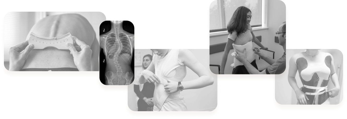
Scoliosis is a lateral curvature of the spine affecting about 7 million people in the US today. About 80% of patients are female. If left untreated, it can lead to back pain and potentially require surgery.
The standard treatment involves:
- Wearing a rigid brace for an average of 18 hours per day to help slow the progression of curvature.
- Wearing a monitor to track brace-wearing time and ensure compliance.
- Rehabilitation exercise after taking off the brace to prevent muscle from weakening.
This design project aims to support effective scoliosis treatment and management.
Secondary research
“Only 10% of guardian knows their child's actual brace wearing time.”
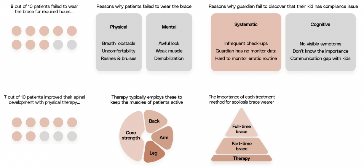
The Challenges
However, I found that there are 3 challenges hindering the effectiveness of scoliosis brace.

Track Compliance
Few Check-Ups
Rehab Routine
No better way for patients and parents to track brace time that uncovers compliance issue.
Patients are disconnected from doctors until few months later to report compliance issue.
Maintaining the routine to activate muscle post-bracing can be challenging.
If Challenges is unresolved...
Failure to recognize compliance issues as they emerge can:
- Impact life quality due to pain
- Psychological distress
Failure to report and address compliance issues can:
- Reduce brace effectiveness
- Increase the risk of surgery
Failure to maintain a rehabilitation routine can lead to:
- Weaken muscles
- Reduce brace effectiveness
The Challenges
However, I found that there are 3 challenges hindering the effectiveness of scoliosis brace.
If Challenges Left Unresolved...
Track Compliance
No better way for patients and parents to track brace time that uncovers compliance issue.
Failure to recognize compliance issues as they emerge can:
- Impact life quality due to pain
- Psychological distress
Few Check-Ups
Patients are disconnected from doctors until few months later to report compliance issue.
Failure to report and address compliance issues can:
- Reduce brace effectiveness
- Increase the risk of surgery
Rehab Routine
Maintaining the routine to activate muscle post-bracing can be challenging.
Failure to maintain a rehabilitation routine can lead to:
- Weaken muscles
- Reduce brace effectiveness
Design Goals
Design an app for scoliosis patients to:

Primary
Encourage better brace-wearing habits in users

Secondary
Report and address compliance issues efficiently

Lastly
Establish consistent rehabilitation routines
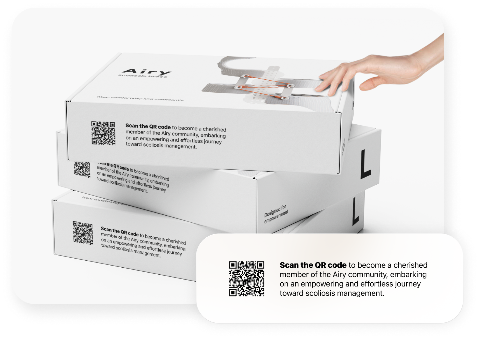
Onboarding Prelude
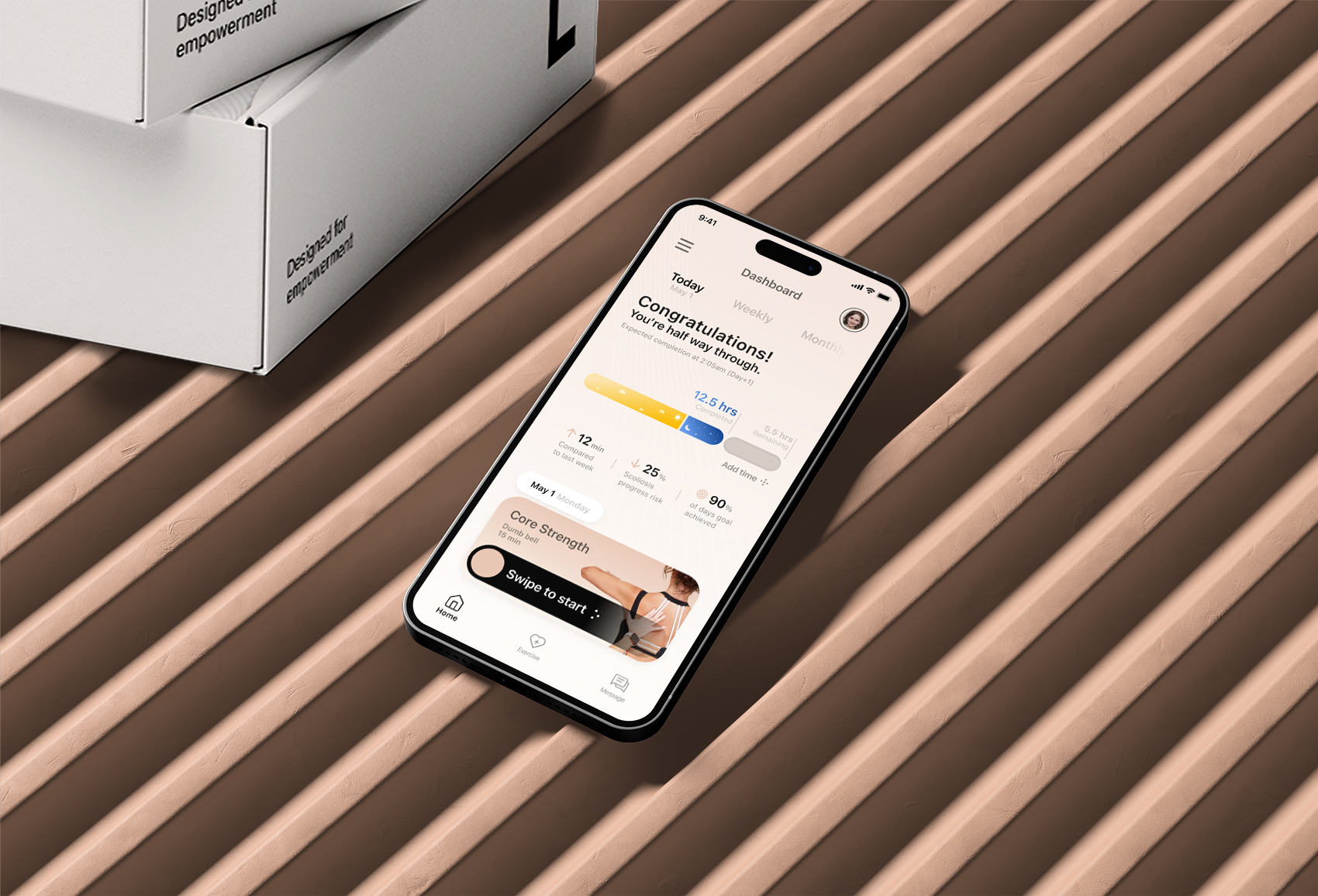
User journey begins with the initial touch point - packaging.
A QR code prompts user to download the Airy app, creating the expectation of a transformative and empowering journey.
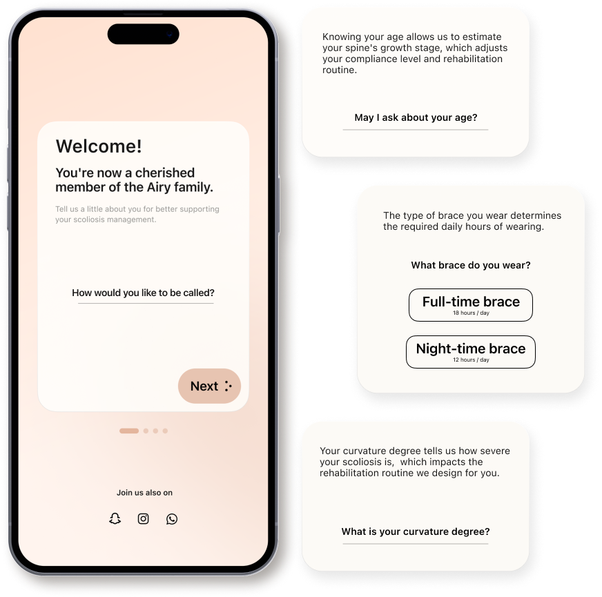
Onboarding
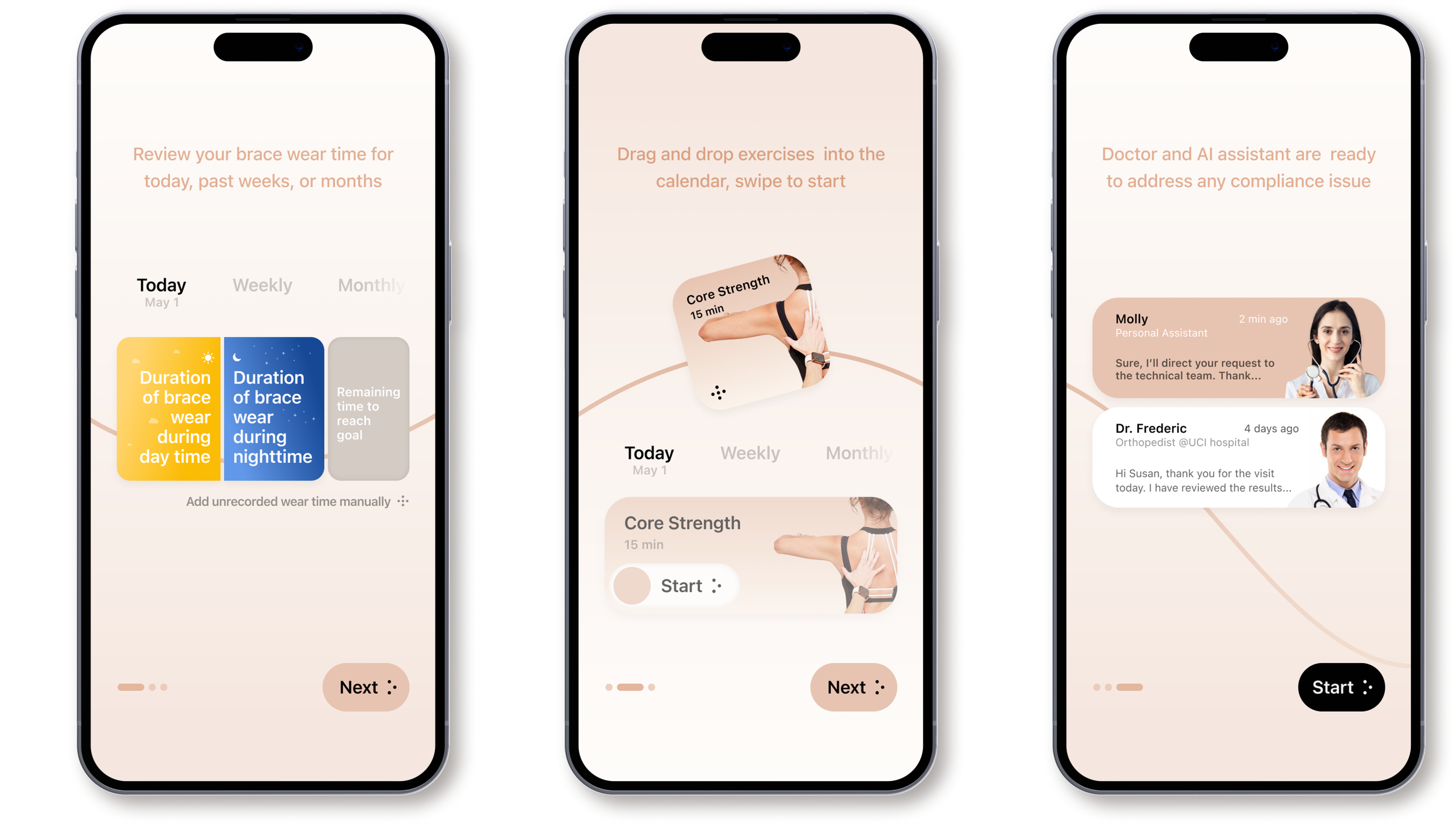
Launch screens collect information with four optimized questions for precise personalization, while guiding users to the home screen quickly to minimize drop-off.

Onboarding — tutorial
Tutorial screens introduce the application and increase trust before users commit to daily tracking.
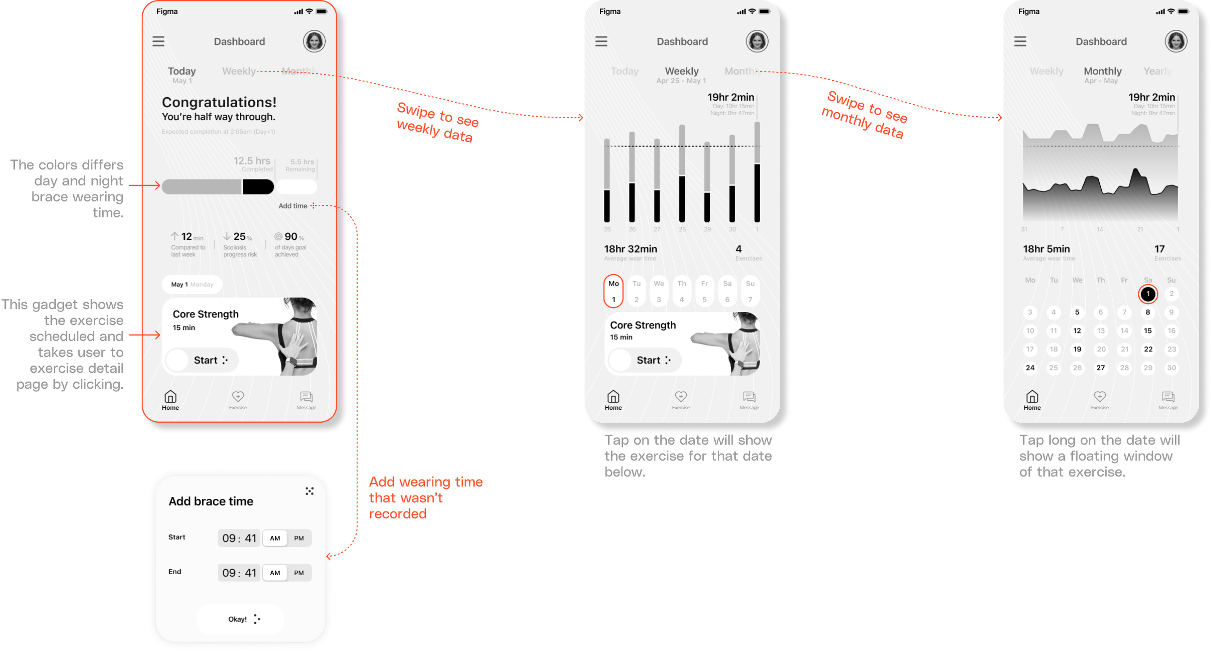
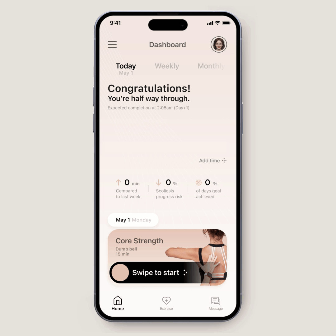
Boost compliance
Welcome users with an encouraging message, show current wearing progress and achievements to boost engagement, then conclude with a call to action to start rehab exercises today.
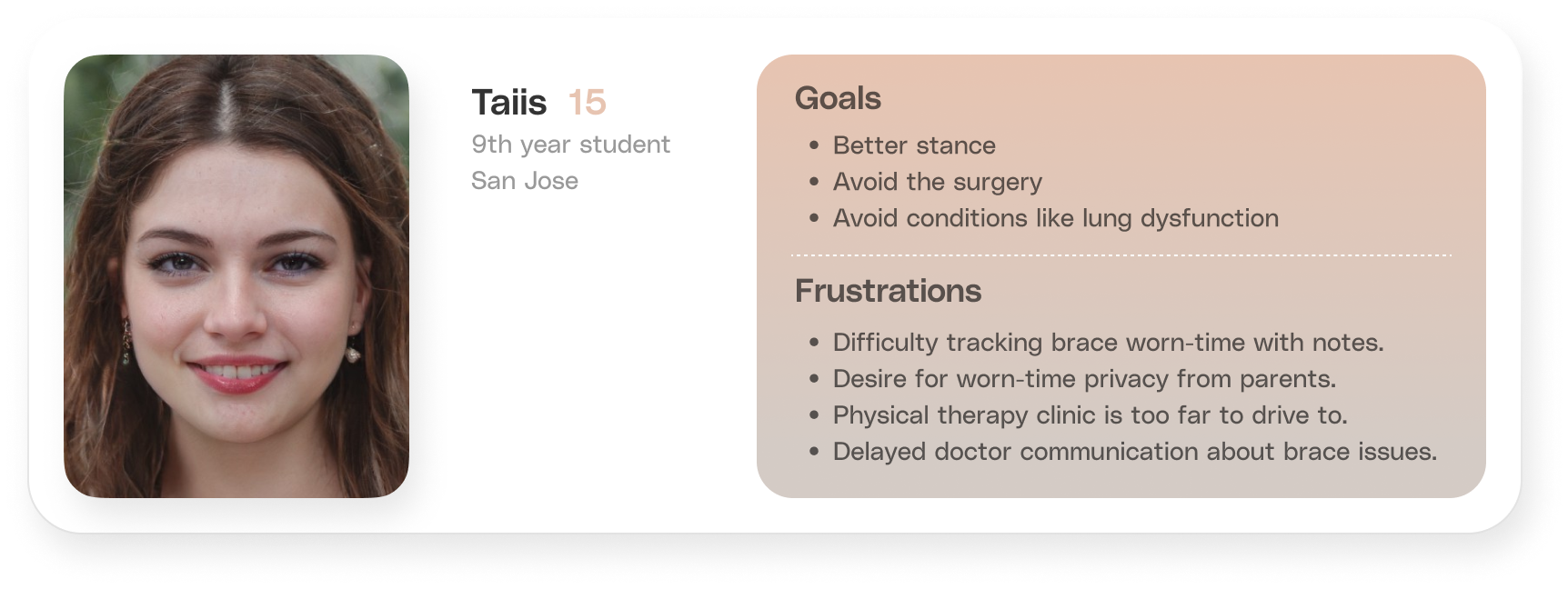
Persona
Based on 6 interviewees: I contacted six scoliosis patients online who had worn a brace and were in three different stages of treatment from a scoliosis support group. I distilled their complaints into one persona shown in the tabs.
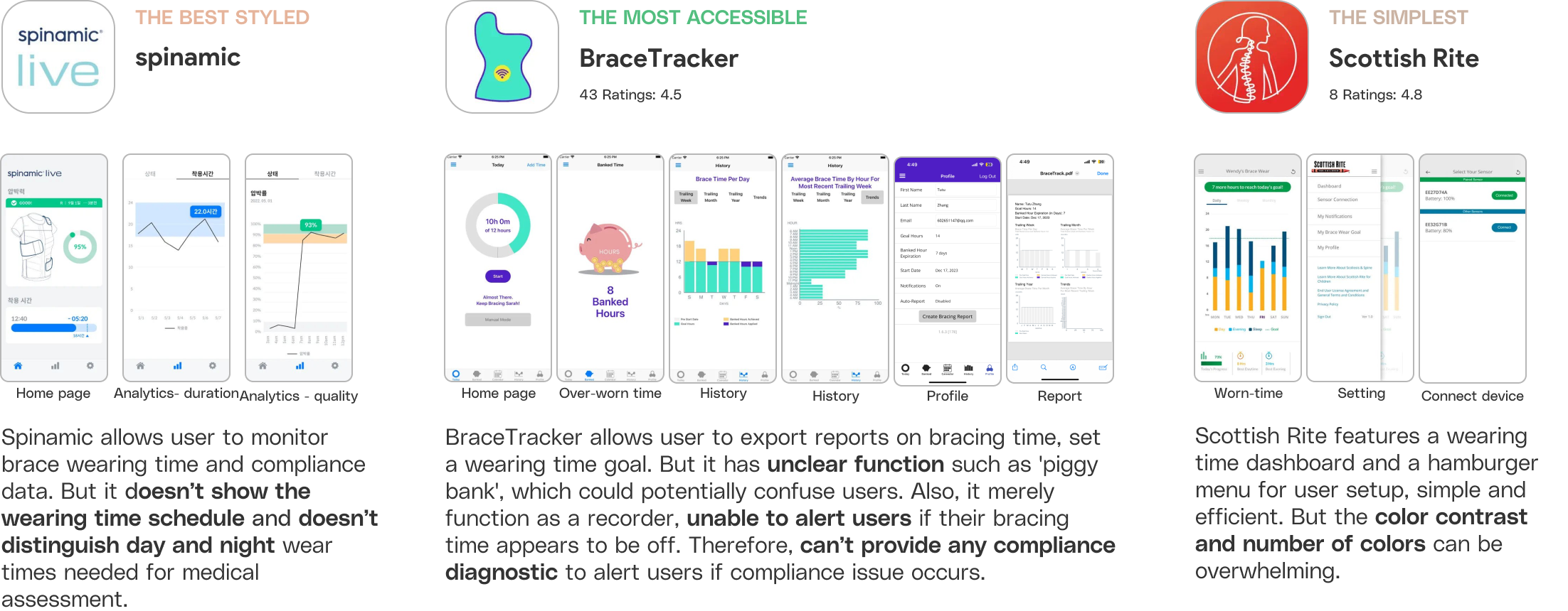
Competitor Overview
I analyzed the user experience of three competitors to understand their capabilities, challenges, and opportunities for improvement—helping identify market gaps and where Airy could differentiate.
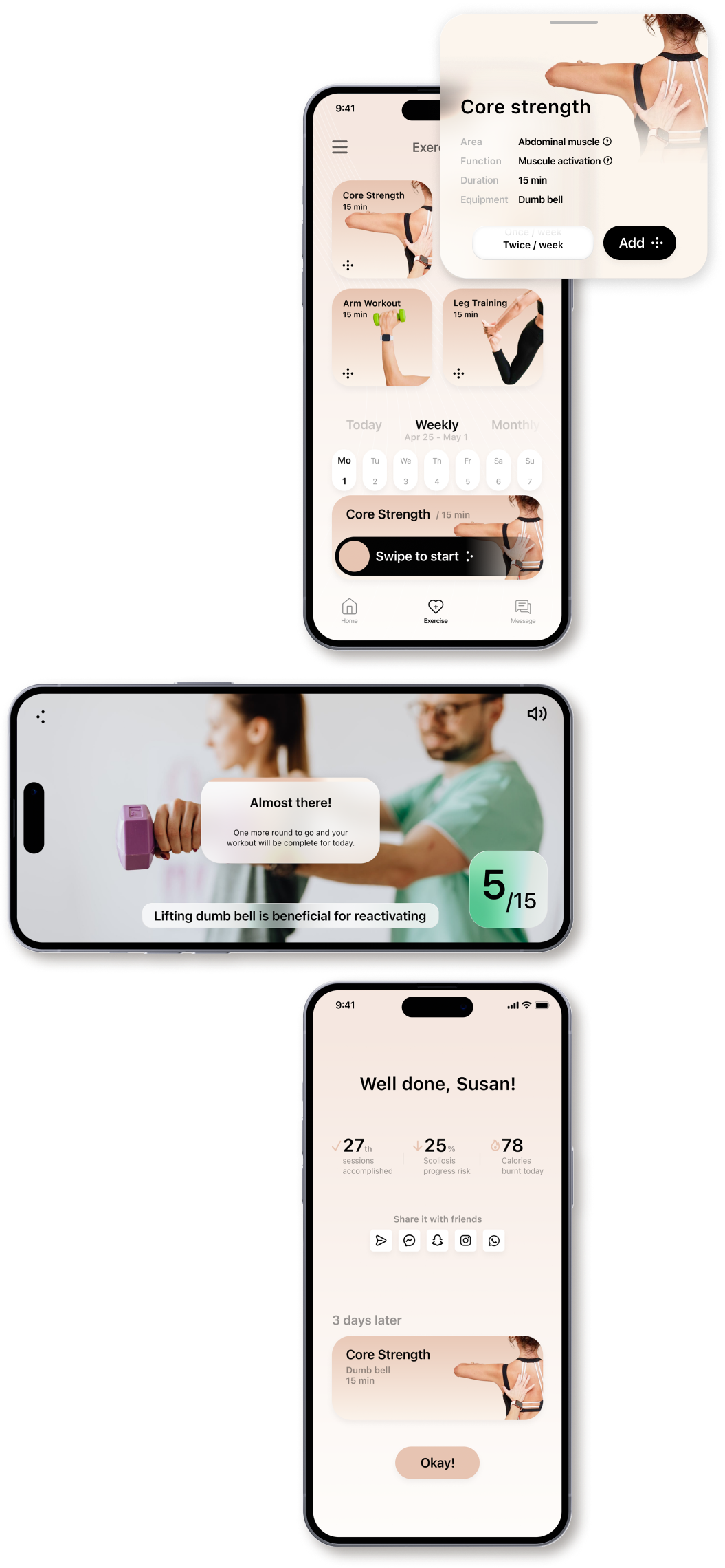
Rehab exercises
An algorithm matches exercises to the user based on profile information, reducing the abandon rate associated with planning. Milestone moments surface encouragement during and after exercise to keep engagement high.
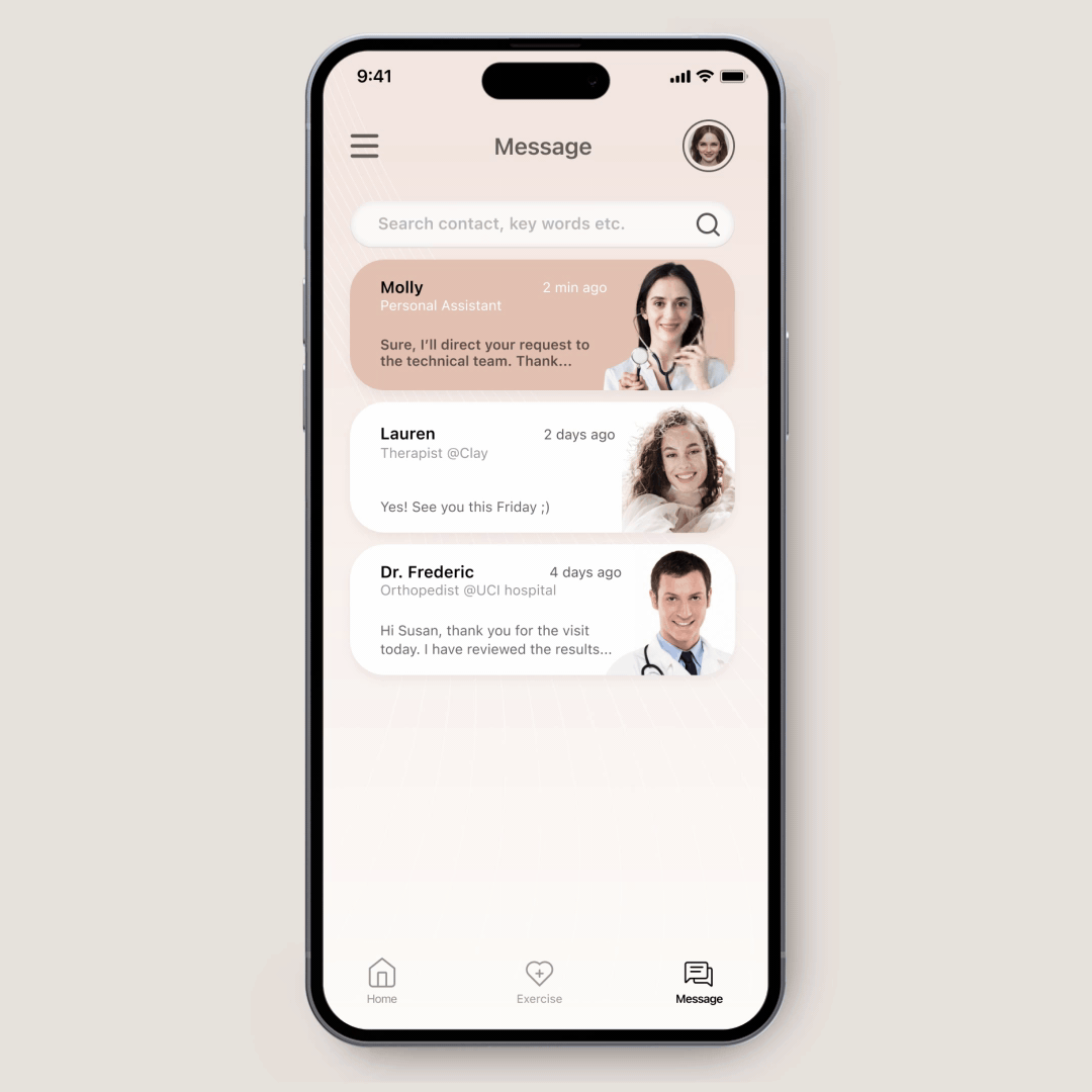
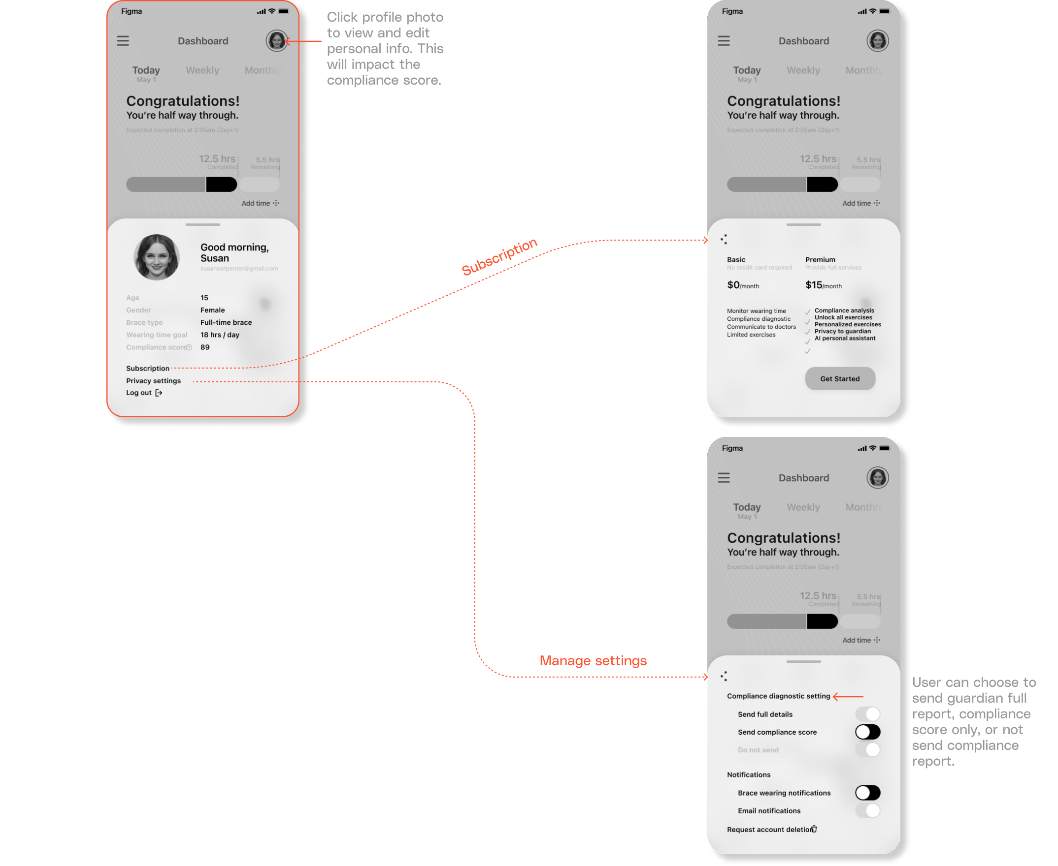
AI personal assistant
The assistant identifies and resolves compliance issues, addresses user concerns, and eases workload for clinicians by handling outsourceable questions—such as discomfort that may need brace adjustments.
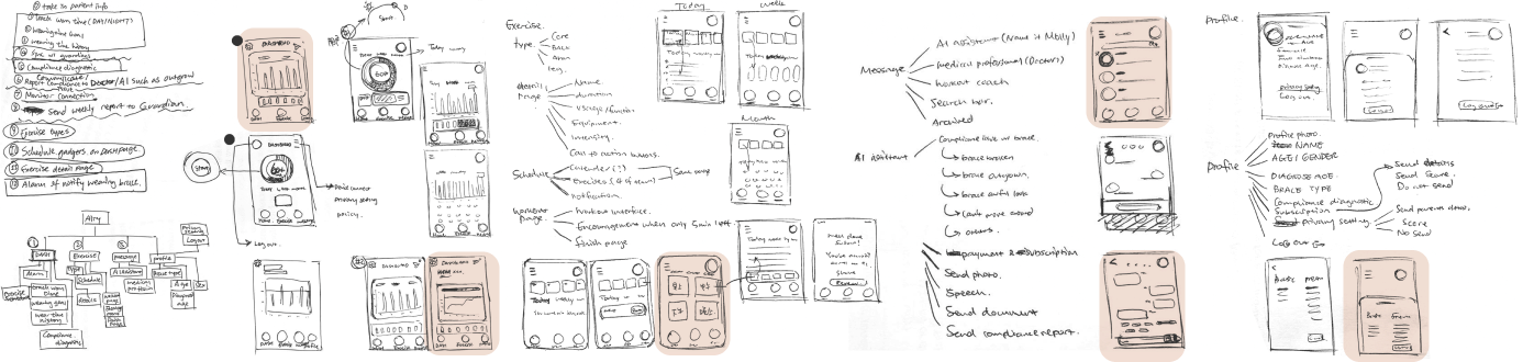
After the research, I conceptualized the design…
I started with sketches on paper, developed concepts from feature hierarchy and the user flow I wanted people to follow, then moved into mid-fidelity prototypes.
Information Architecture
Building information architecture organized the logic and gave a framework for the information I wanted to include—reducing redundant repetition in later stages. I placed Home, Exercise, and Message in a sticky bottom menu because they are the most important features and should stay visible across screens. Profile stays in the top-right corner for less frequent tasks and clear separation.
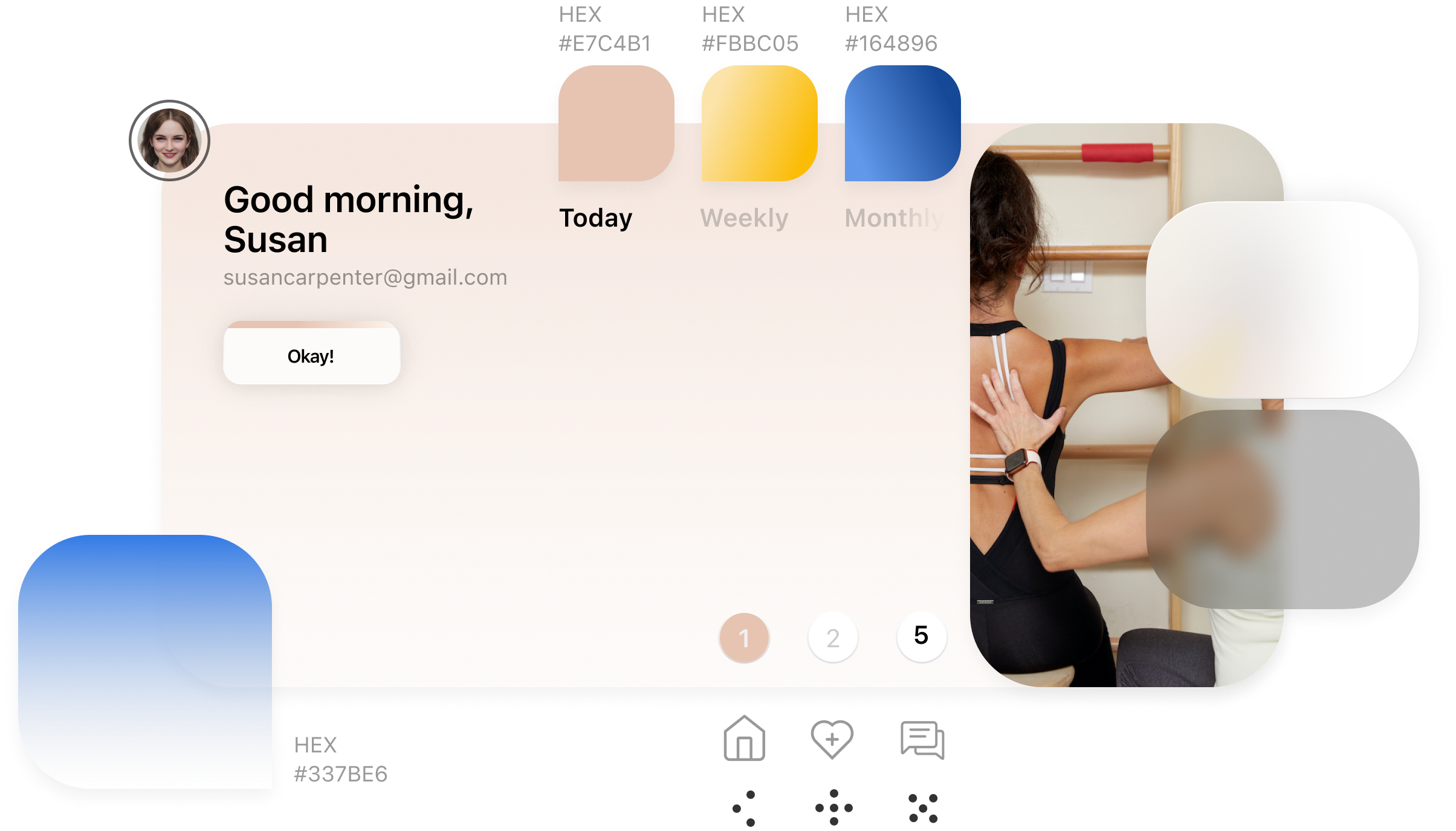
Style guide
I used a rose pink hue as the primary color to create a calming visual experience, helping users distance themselves from the stress of scoliosis. Gradient accent colors highlight important information and titles.
Mid-fi to high-fi prototype
I identified the different styles from the mid-fi prototype and created a visual guide for the interface. While applying visual design, I optimized layout, margins, type sizes, and color to reinforce hierarchy.
Usability test 1.0
First version tested with three designer peers
I conducted a usability test with three designer friends on the first version of the design. They surfaced issues with navigation and clarity; I incorporated their feedback into the second version.
Mid-fi prototype
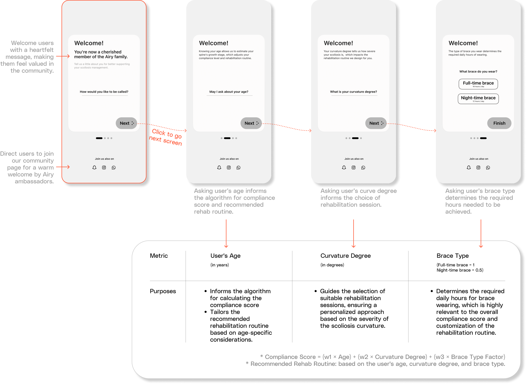
Launch screens collect minimally four questions—name, age, curvature degree, and brace type. To reduce churn, it is crucial to foster positive emotion and motivation. An intuitive, simple home eases cognitive load when users are already managing brace wear: clear wear-time progress, incentives to complete required hours, and motivation to start today's exercise.
I used conversational UX to encourage continuity. Placing the exercise schedule on the home page hooks engagement beyond monitoring data alone. Rehab exercises are vital yet often missing in related apps; orthopedists highlighted their role in preventing muscle weakening and relapse—so the exercise section delivers personalized recommendations and motivational prompts.
The impact
36%
more patients say the Airy app helps their doctors analyze whether a treatment plan adjustment is needed, thanks to better engagement in wear time and exercise tracking.
76%
of testers could find how to check wear time, access exercise tutorials, and update scoliosis progression within the first three attempts.
Orthopedists have limited availability, which delays addressing brace compliance until appointments months later—often too late. Inspired by apps like Lemonade, I explored an AI assistant to resolve outsourceable compliance issues such as discomfort that may require brace modifications.

Usability test 2.0
I tested the high-fidelity prototype in maze.co with eight users. Key findings: (1) users missed “notification” when it lived under an unrelated script like privacy settings; (2) onboarding pages were essential—without them, almost no one could infer the app's purpose at first glance.
Takeaways
Experience starts earlier than I thought
I once believed the user experience started with the launch screen of an app, but it truly begins much earlier. It can be the first advertisement seen, initial website search, or unboxing a product. Even packaging that entices users with a seamless onboarding process shapes expectations. Considering the entire user journey, from awareness to advocacy, allows for a cohesive experience that helps a product stand out. Designing holistically across all touchpoints creates a more impactful overall experience than just thinking about the screens.
Experience design follows design intent
I realize that the interface serves as a vehicle for communicating information efficiently and guiding user actions in a clear, intuitive manner given hardware constraints. The goal is to direct users down a desired path by prioritizing calls to action. Designers must thoughtfully utilize limited screen space to optimize this experience.
Typographic consistency across all interfaces
Typography hierarchies are constrained by space and accessibility. Designers must analyze a system's type usage holistically to communicate informational importance at first view. Merely using the largest type on a page does not guarantee consistent hierarchy across interfaces. Establishing typographic guidelines promotes uniformity by strategically employing type sizes for optimal user orientation.